Sarah & Burt
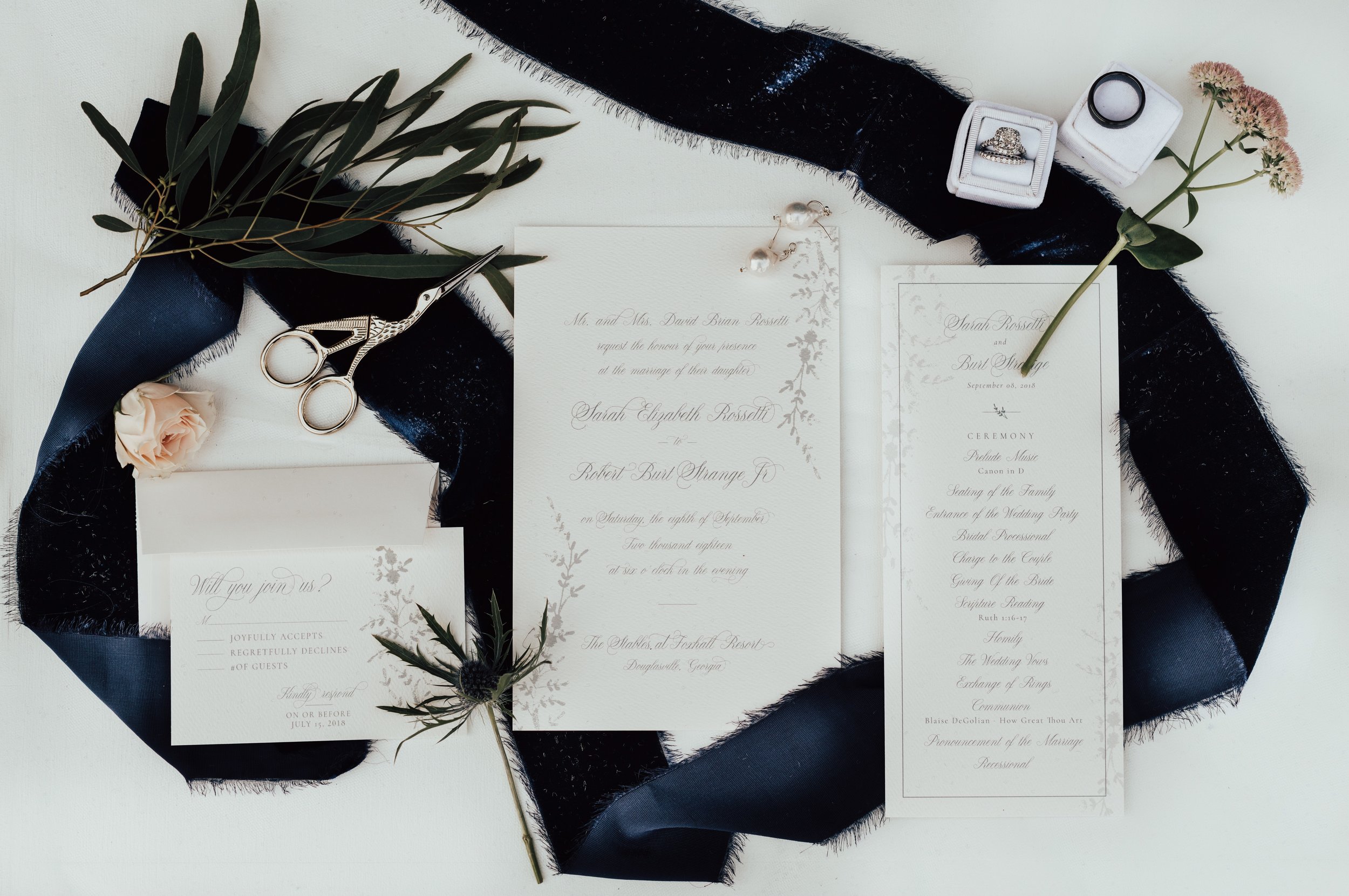
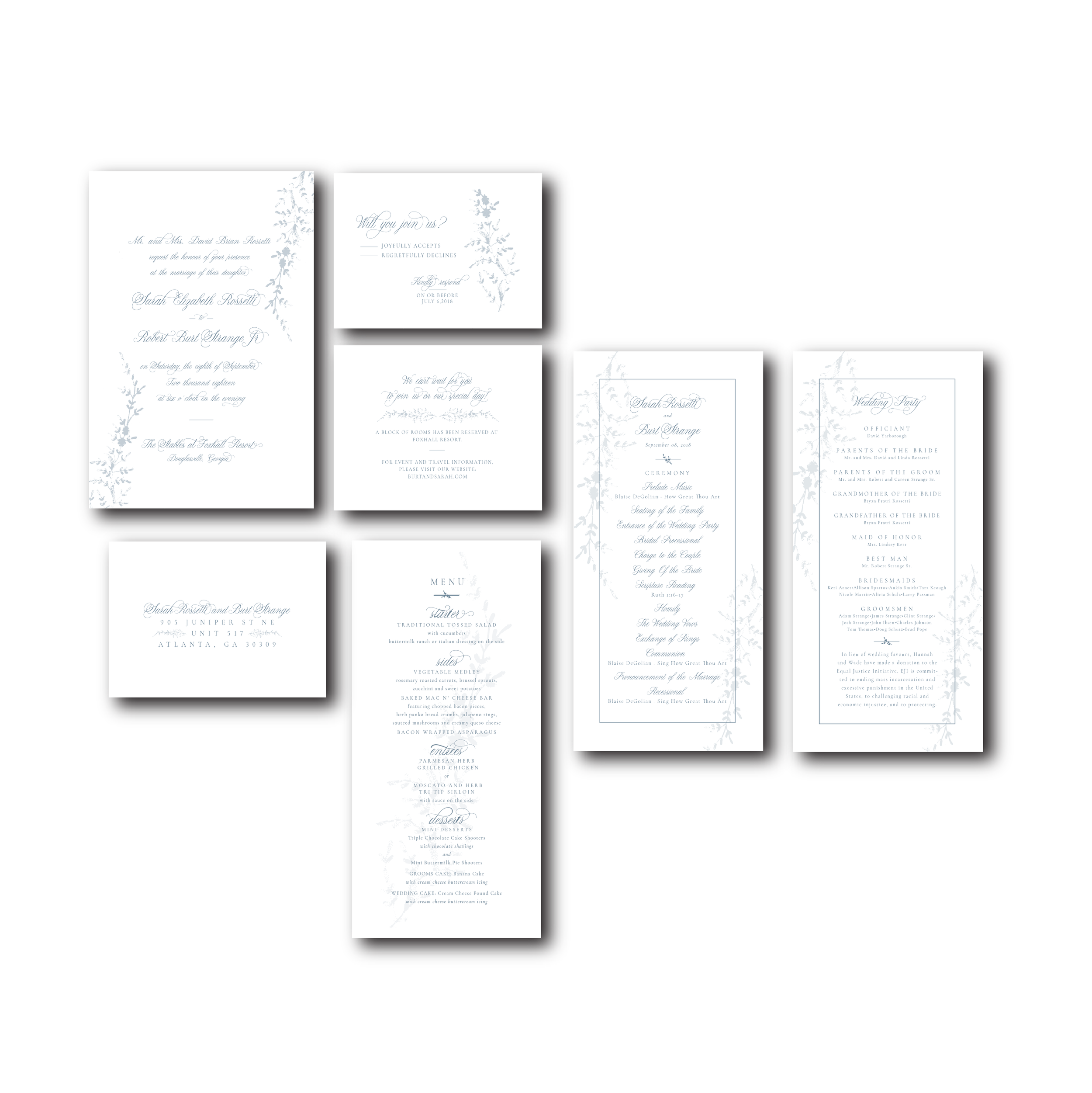
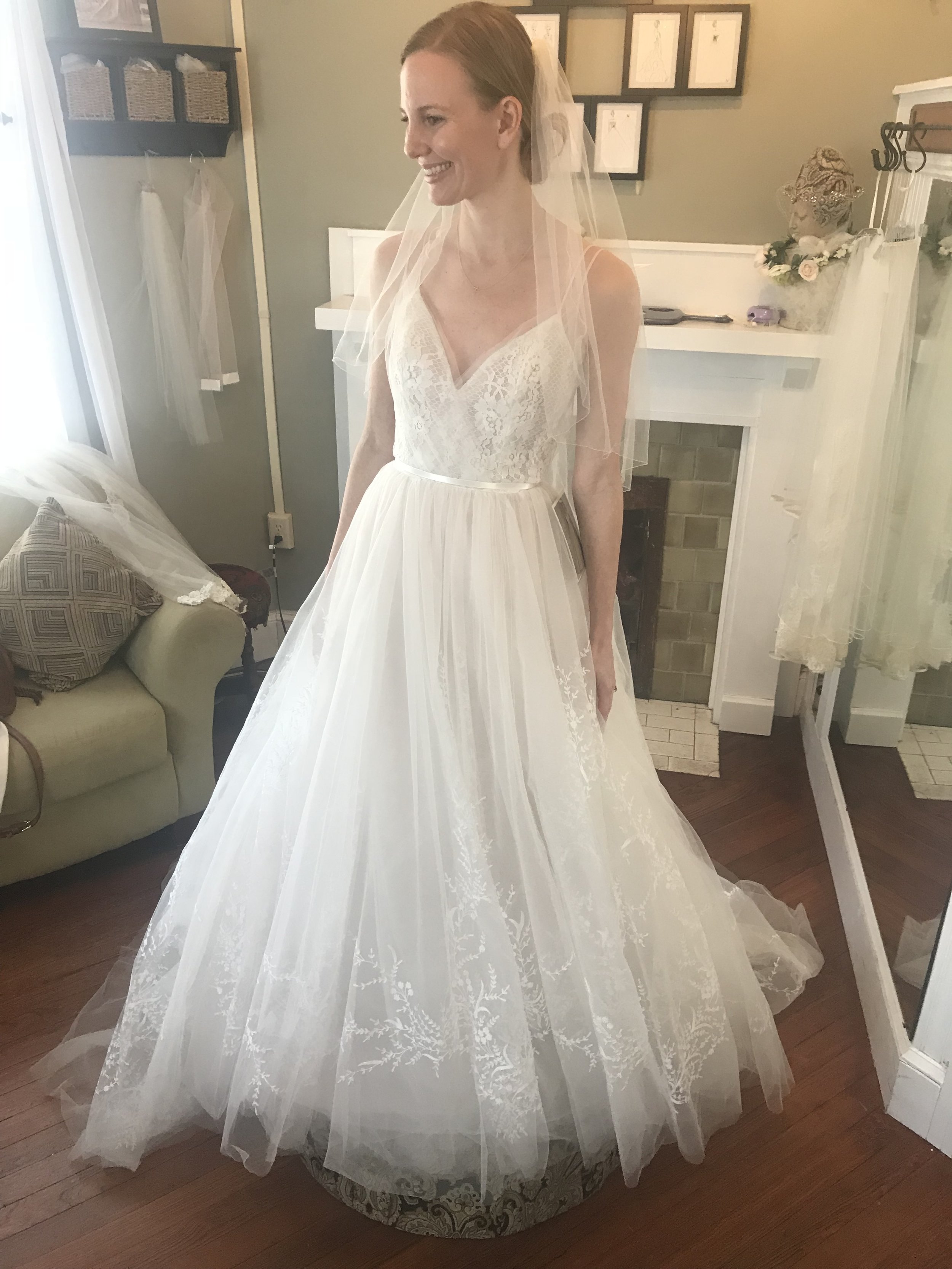
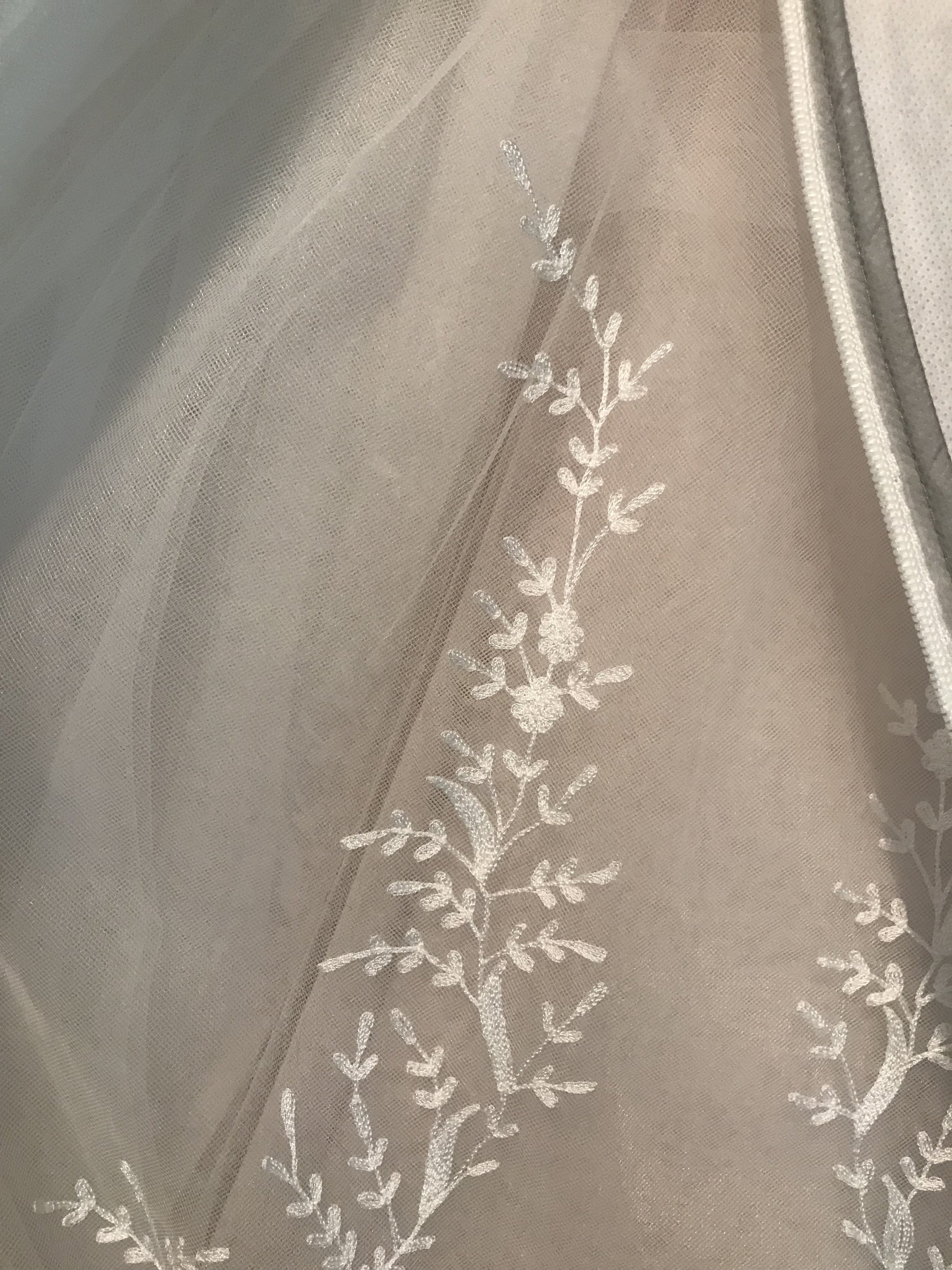
Sarah is a dear friend who wanted something special for her wedding stationery. Having fallen in love with her dress, a whimsical style with layers of tool and a unique floral element sewn in, we used it to anchor the branding for her wedding suite.
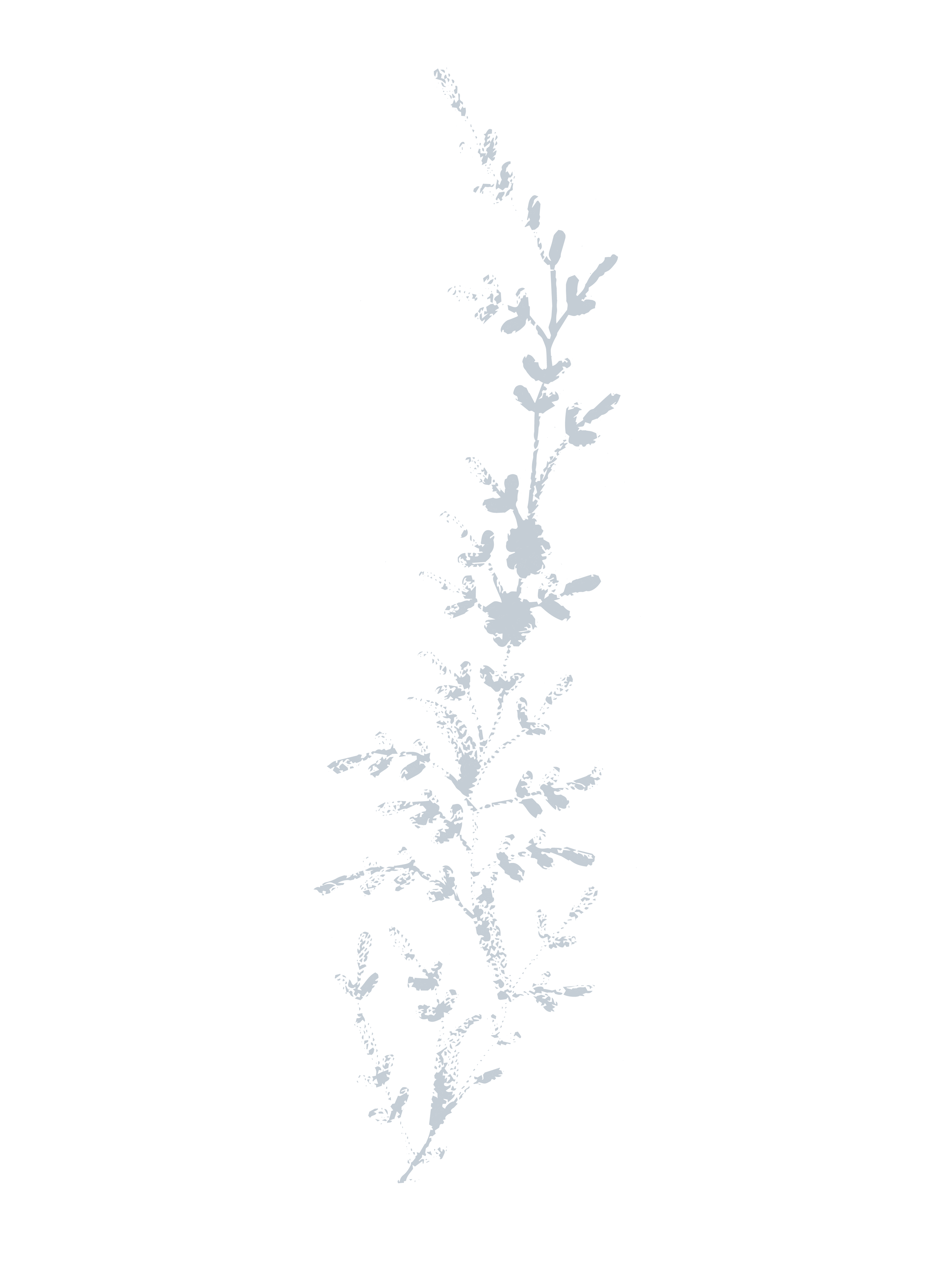
I traced the floral element from the skirt and applied it to all the printed pieces created. This, paired with a french blue and classic font brought this wedding suite together beautifully.
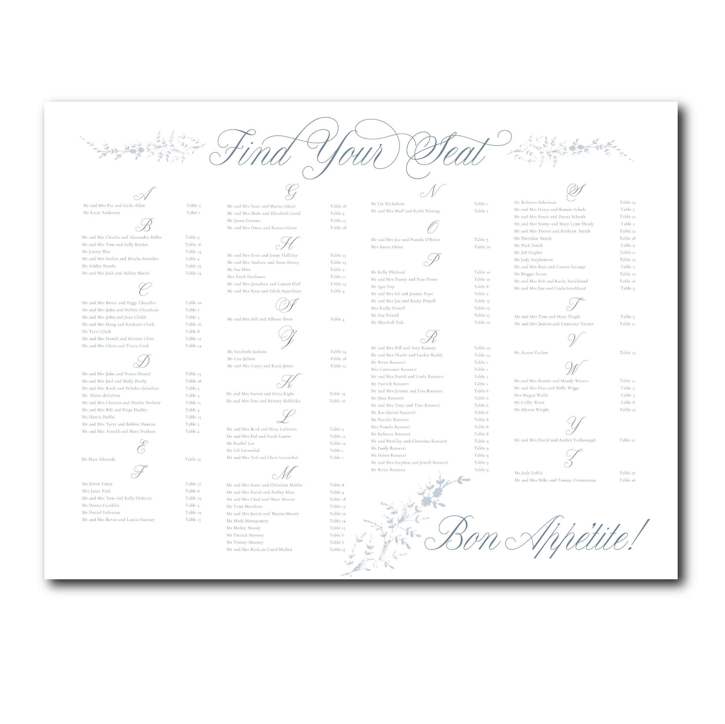
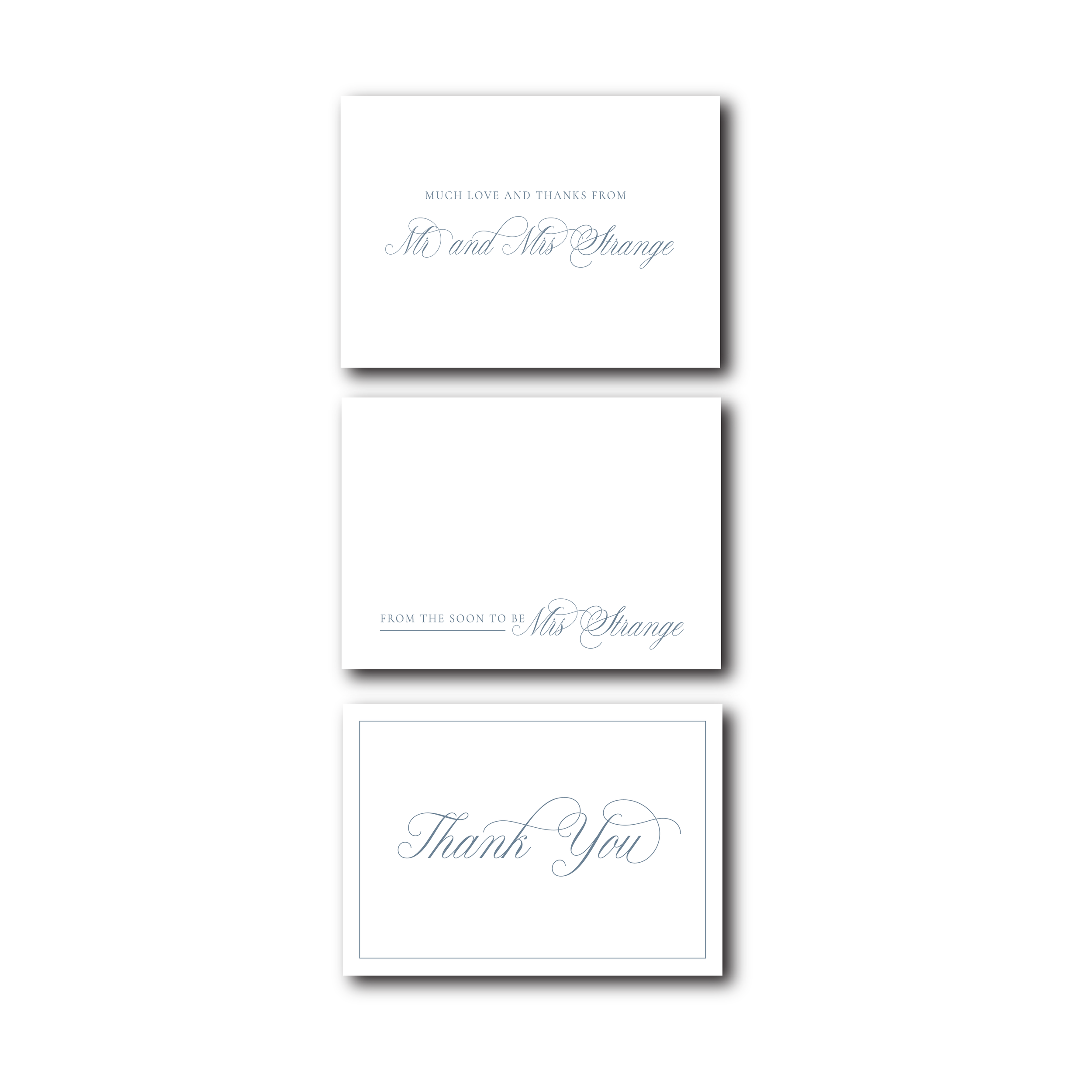
This wedding branding included an invitation suite with textured paper, menu, thank you cards, and a seating chart. Take a closer look below.
Project Scope
Branding Design
Graphic Design
Print Design
