RevAscend: A Custom Wordpress Site
About the Client
Meet Krista Crane
of RevAscend
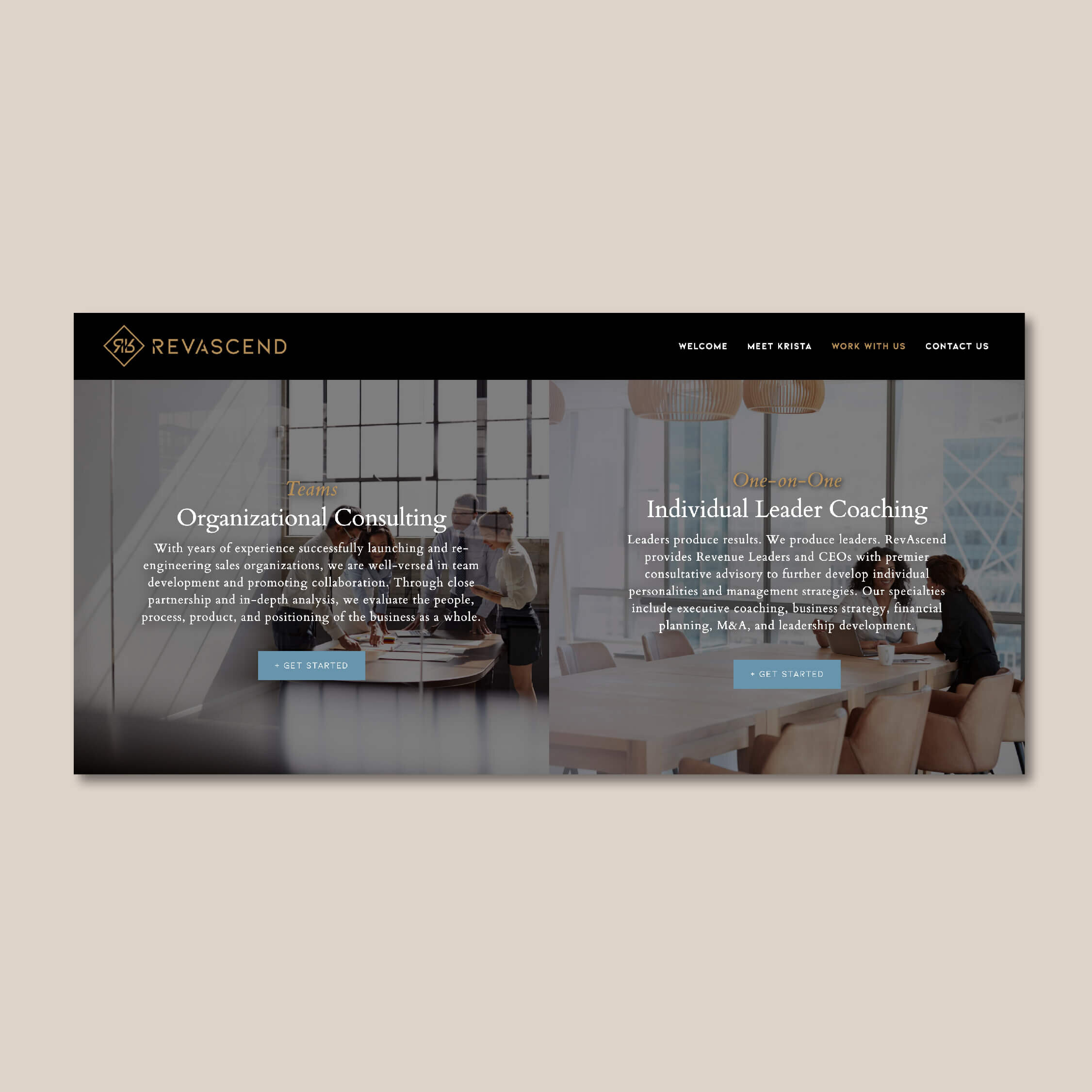
With years of operational experience streamlining high-performance sales teams, Krista launched RevAscend to provide strategic revenue growth consulting for sales organizations with the ambition to elevate. She’s an ambitious visionary, offering team consulting as well as one on one leader coaching.
SERVICES
"
I love to develop people and watch them win.
- Krista Crane, Founder & CEO
ABOUT THE Brand identity
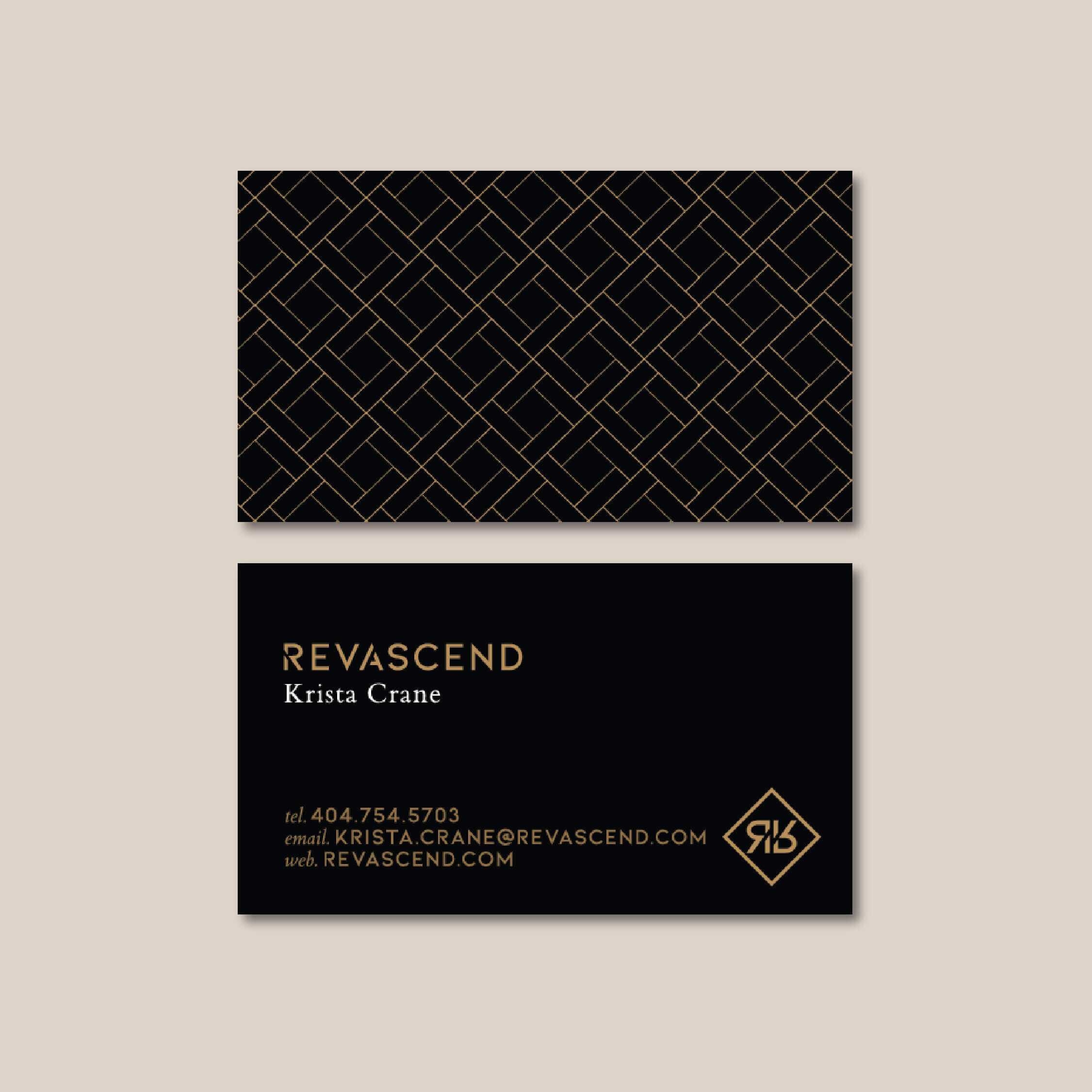
As I mentioned, Krista had tons of vision. She came to me with her brand name and some strong ideas already drawn up for the logo. The concept centered on her target audience’s felt need — they want to see their efforts translate to increasing revenue, thus the brand name RevAscend was born.
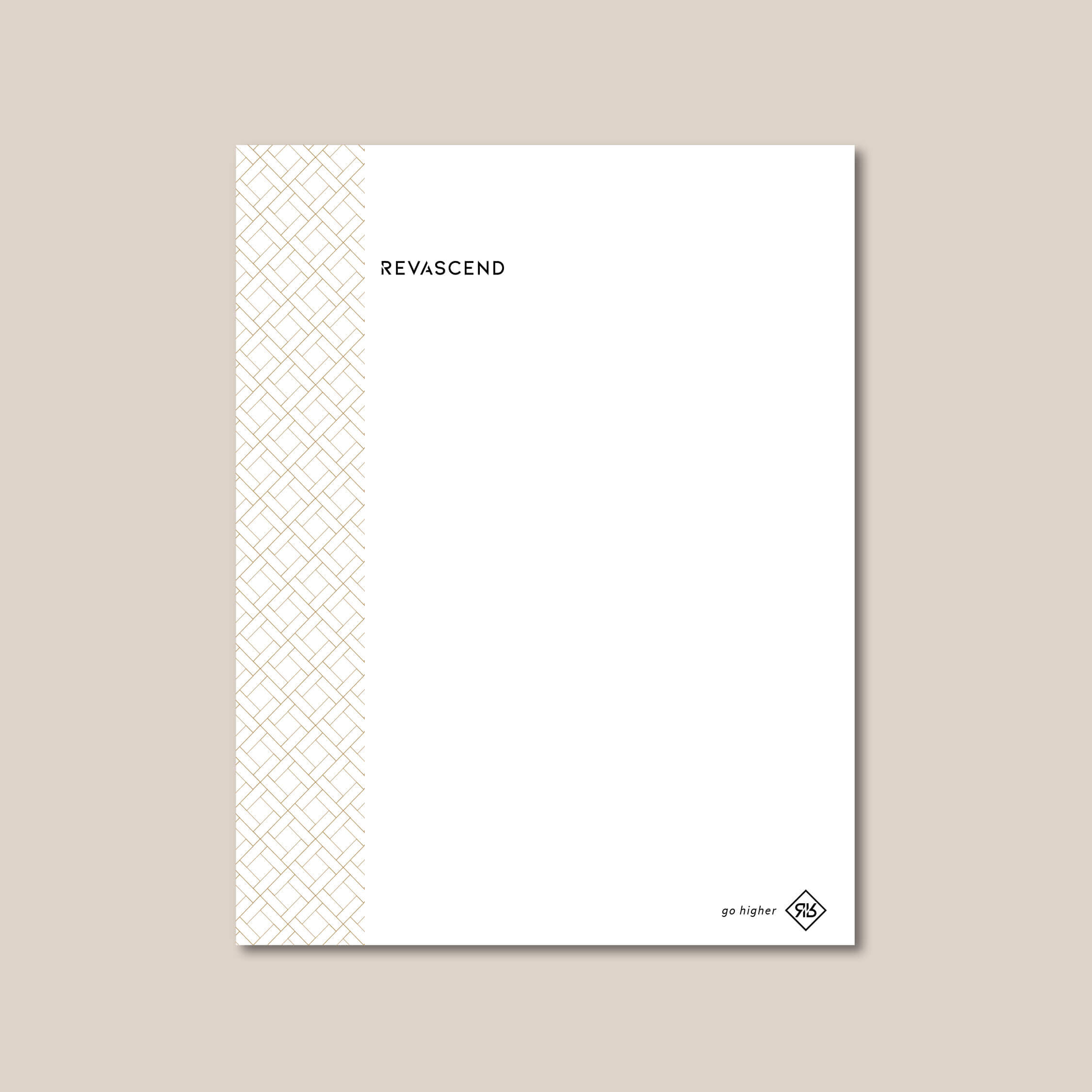
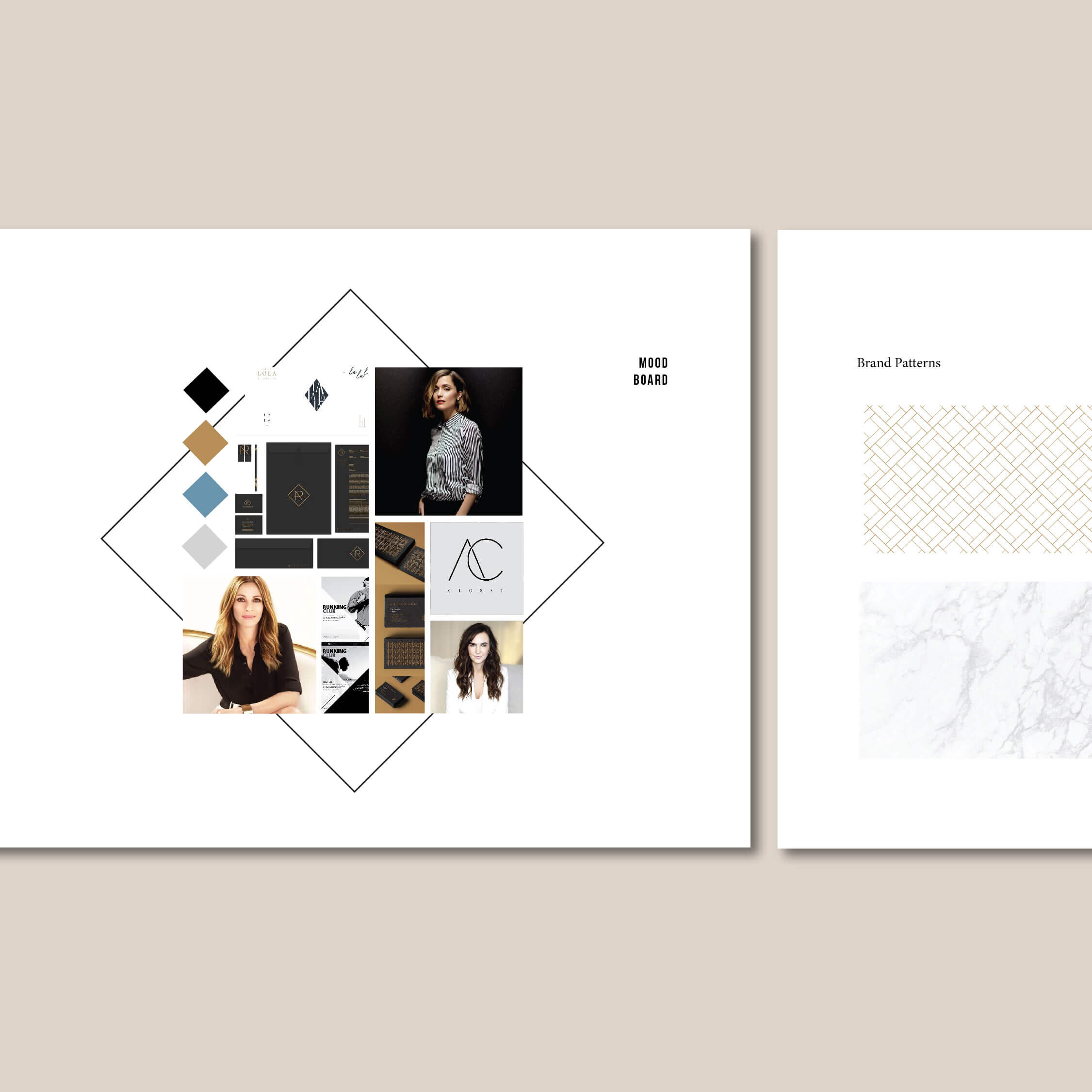
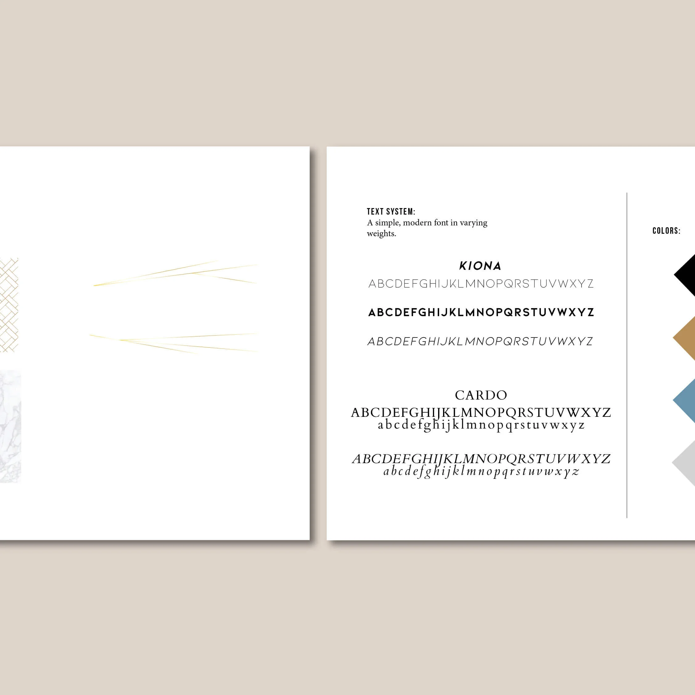
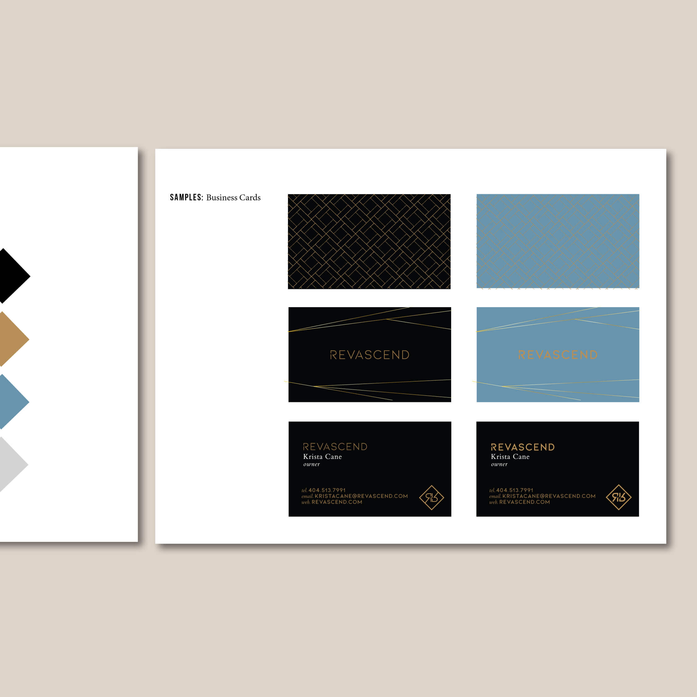
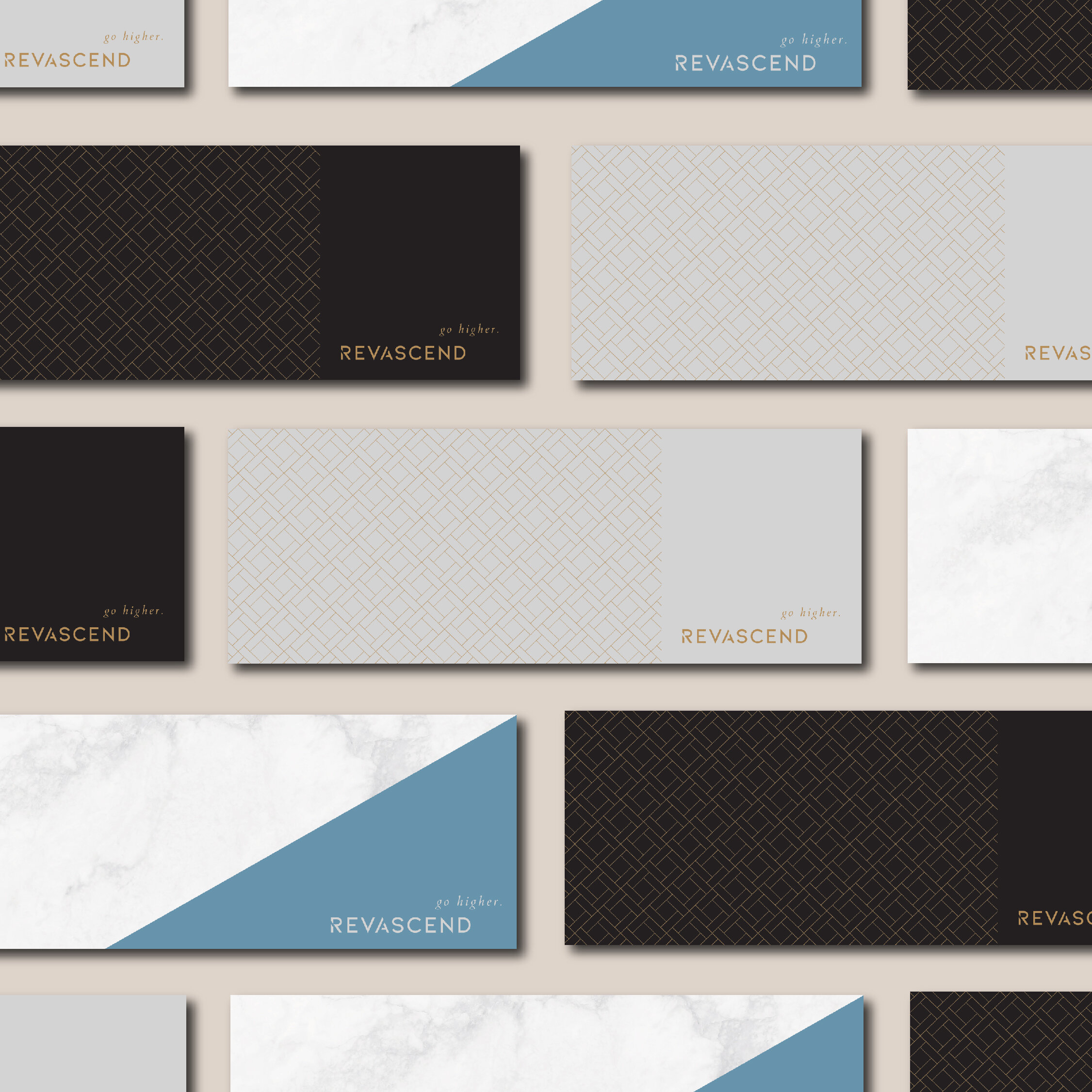
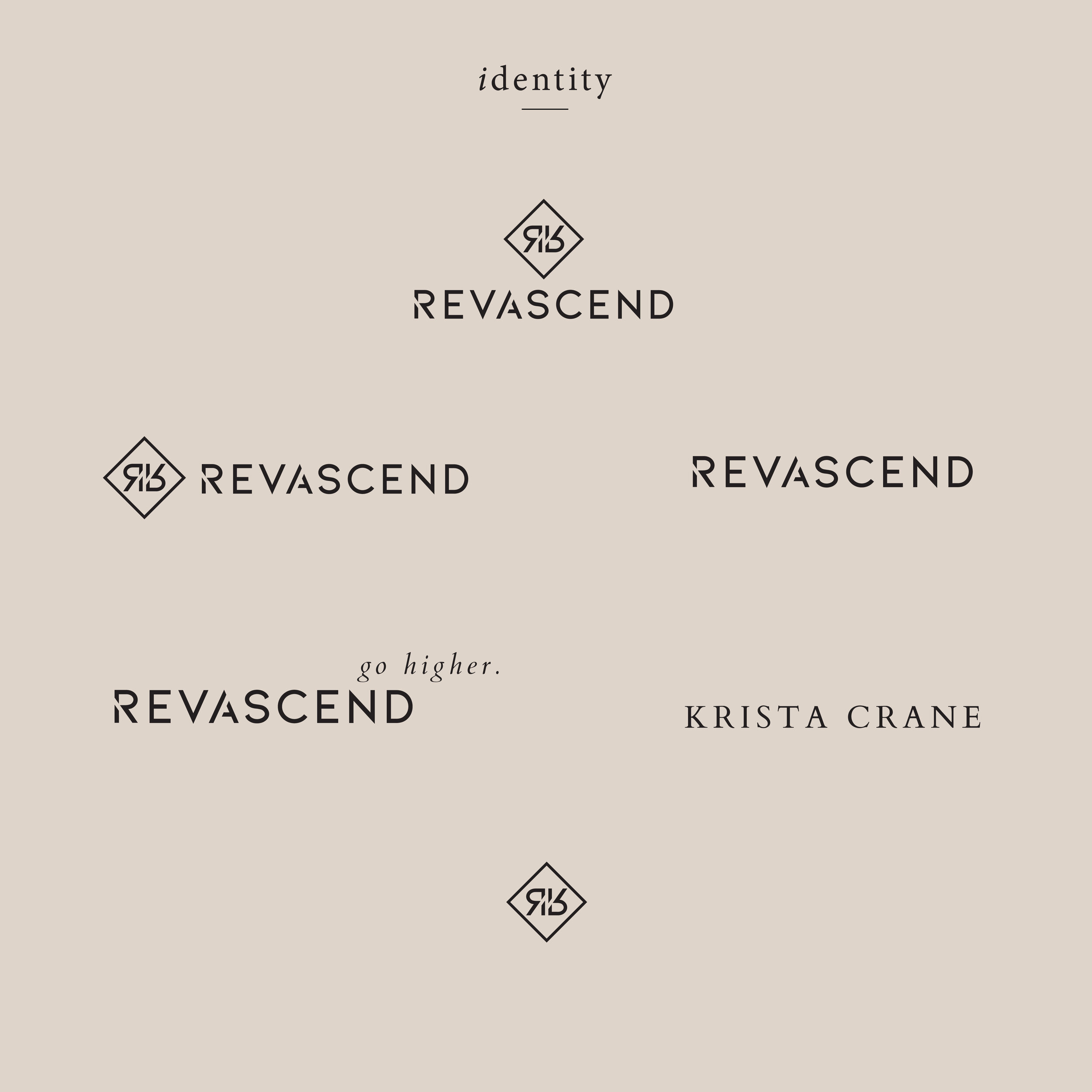
For the look and feel, she wanted a polished, high-end aesthetic that still felt like her. While I tend to steer clients away from their design preferences toward those of their target audience, in cases where you’re “selling yourself” the overall look can incorporate your style and still target your primary audience. For RevAscend, we chose a modern font, some marble textures, a touch of gold and angled lines to subtly convey the upward momentum behind the brand. This branded suite comes with a primary logo, secondary, custom icon and tagline.
About the Website Design
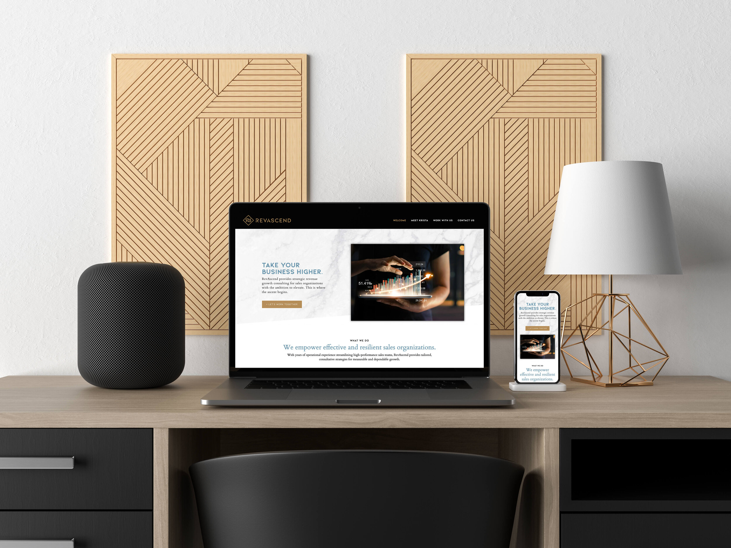
With Krista’s expertise in the industry and vast network, I wanted a website platform she could easily scale on, but one she could still maintain herself. RevAscend is a custom Wordpress Website Design hosted on WP Engine and built using Beaver Builder. If you’re building on wordpress, I HIGHLY recommend designing with Beaver Builder.
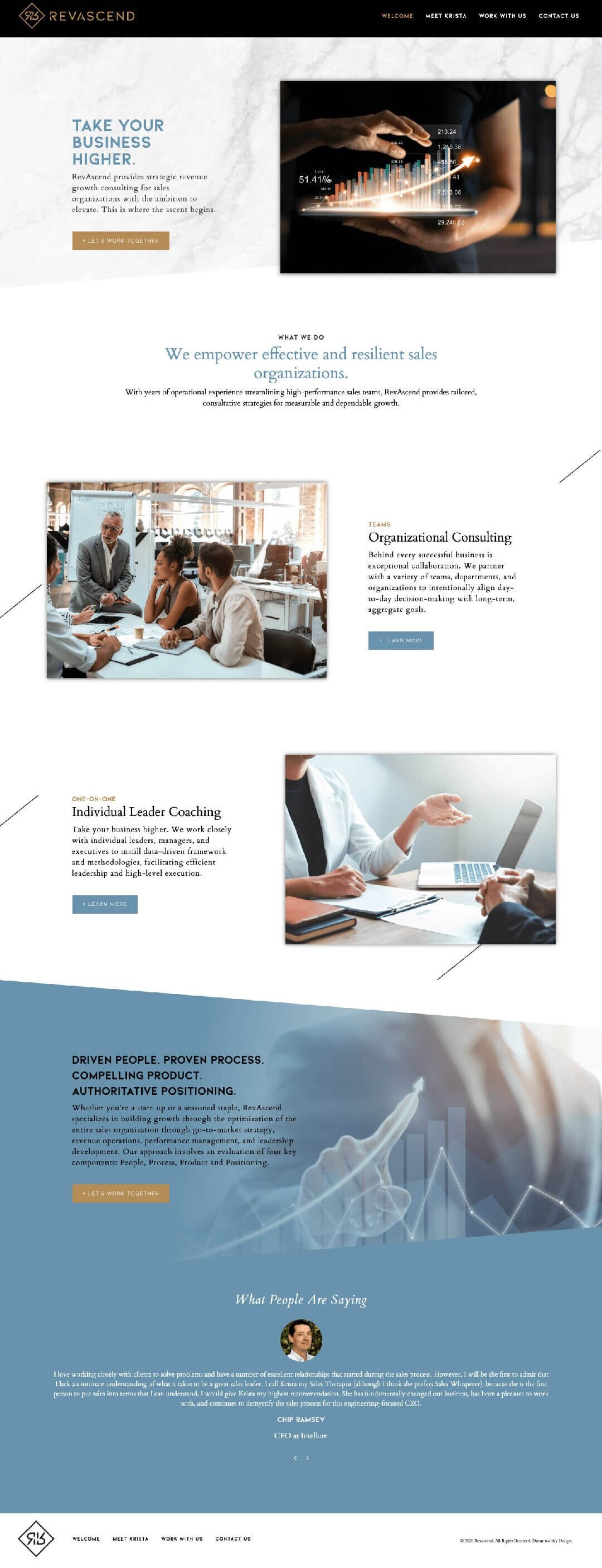
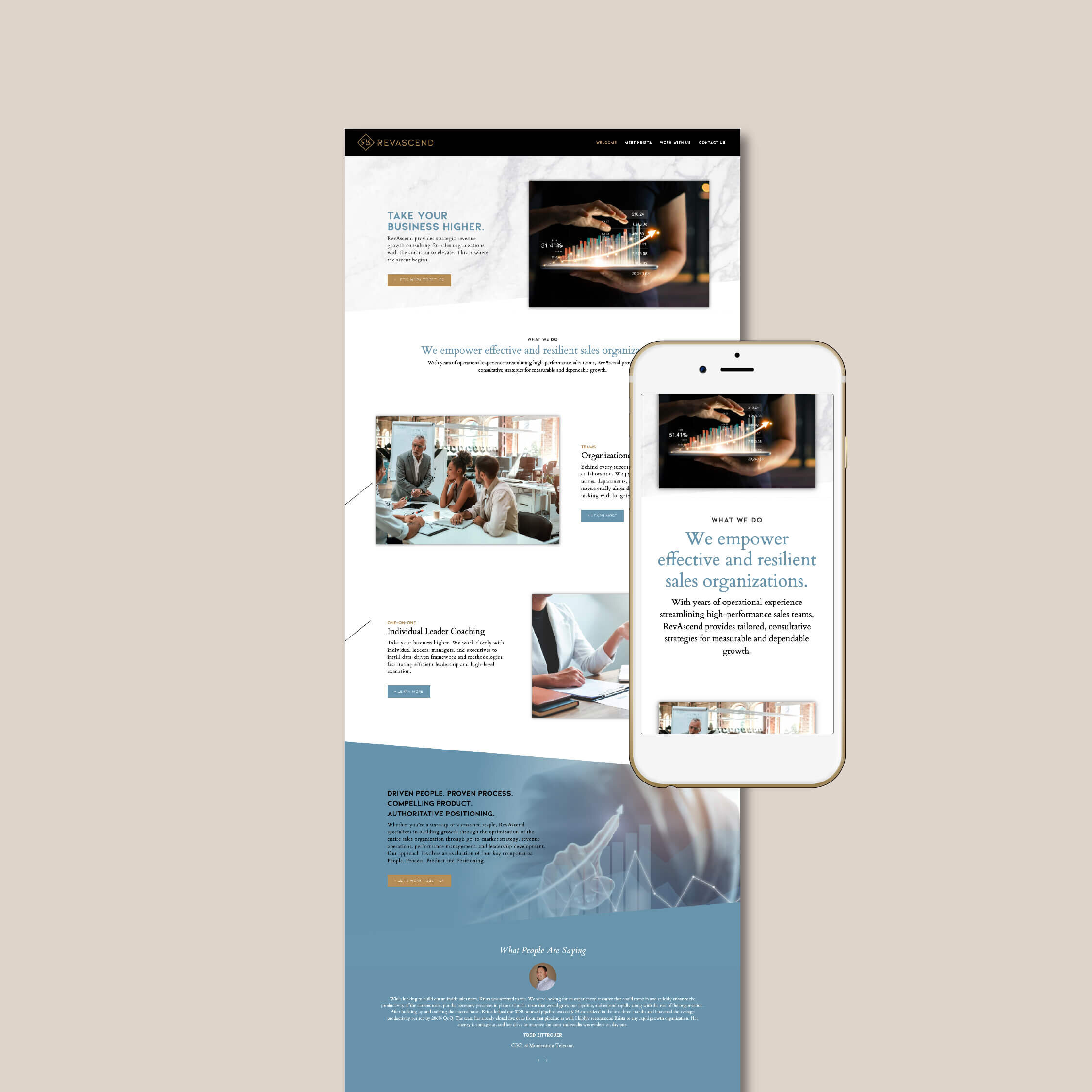
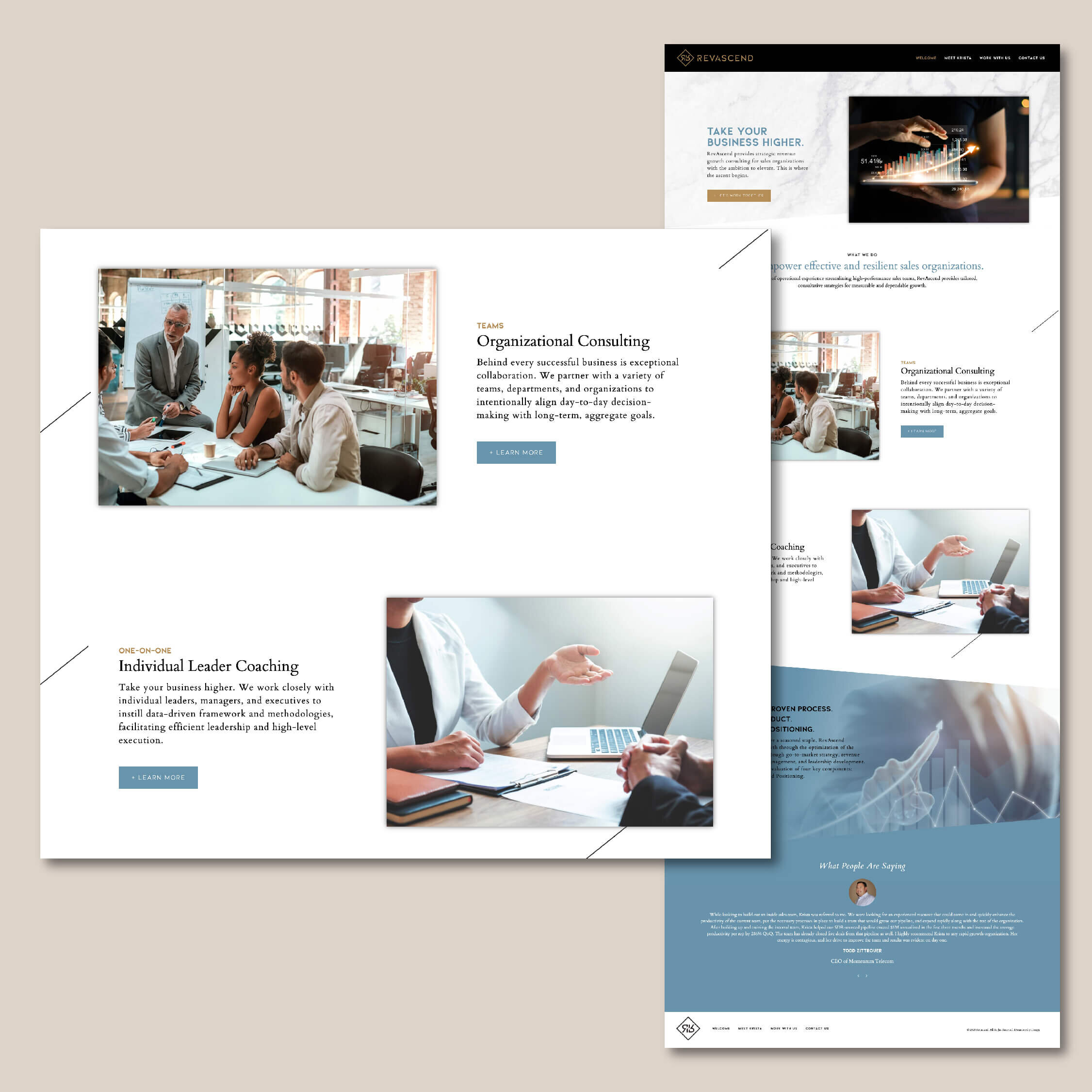
The RevAscend wordpress site opens with a beautiful marble texture and a picture of a revenue graph beside a powerful statement that defines her brand promise: Take Your Business Higher. This section is followed up by another clear “what we do” statement, great for first impressions as well as SEO.
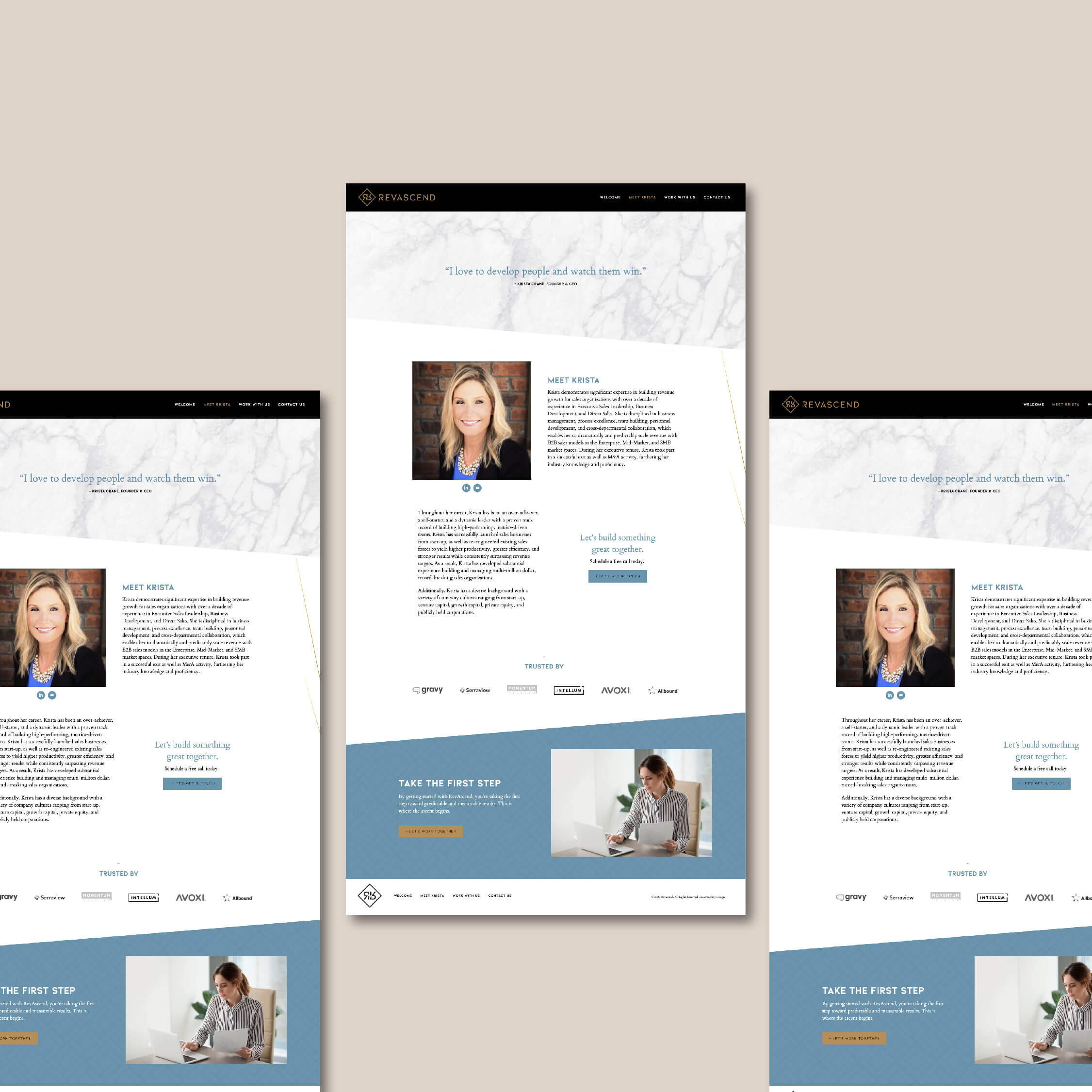
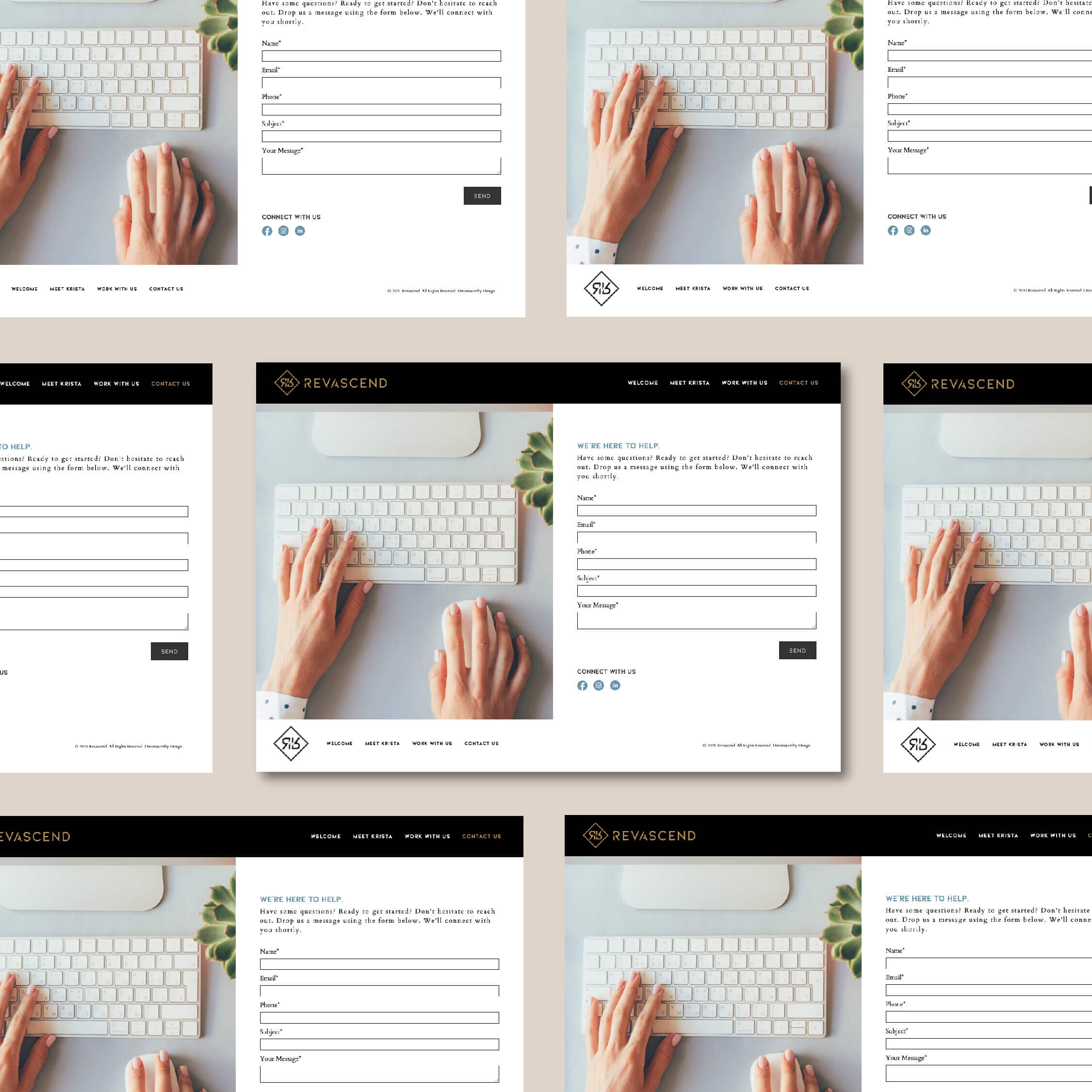
The color scheme and custom pattern are carried throughout the internal pages for a cohesive, professional look. I also added a touch of animation to give the site a bit more movement and make the mobile experience a bit more engaging.
Since consulting sites are credibility pieces, we also added sections to highlight past clients and testimonials so that anyone reaching out on a contact form would be clients she actually wants to work with. Do you need these on your site to help weed out unwanted form submissions? Let’s work together.
Is Wordpress right for your business?
With over 32% of the world’s website’s using Wordpress, over half SiteSmith Studio clients choose it to launch their sites.
See who’s already on Wordpress.


