Steady Hope: A Wix Site
site + Brand Launch
Steady Hope
Kim, a Licensed Professional Counselor in Georgia launched her own private practice— Steady Hope, founded with the mission to create a safe space for people to share their unique stories and backgrounds.
SCOPE OF WORK
Billboard Site + two internal templates, Basic Branding
"
Hope is not wishful thinking.
Hope is the audacity to believe that after everything you have been through, there is more ahead of you. It’s the courage to trust that as long as you’re still breathing,
you have not missed out on what was meant for you.
- MORGAN HARPER NICHOLS
ABOUT THE Brand identity
This lovely brand is our basic branding package which includes a master logo, business cards and custom color palette. This package is best suited for startups to give them a custom identity that can be expanded down the road to add letterhead, a secondary lock up and social media. For SteadyHope, I chose a modern san serif in all caps with lots of kerning to make it breathable. The word mark juxtaposes steady and hope as one word, with a heavier weight on hope so it’s the anchor of the brand, just as it’s the anchor for our very souls. A secondary script adds some dimension and personality to the modern and gender neutral look.
Built on wix —
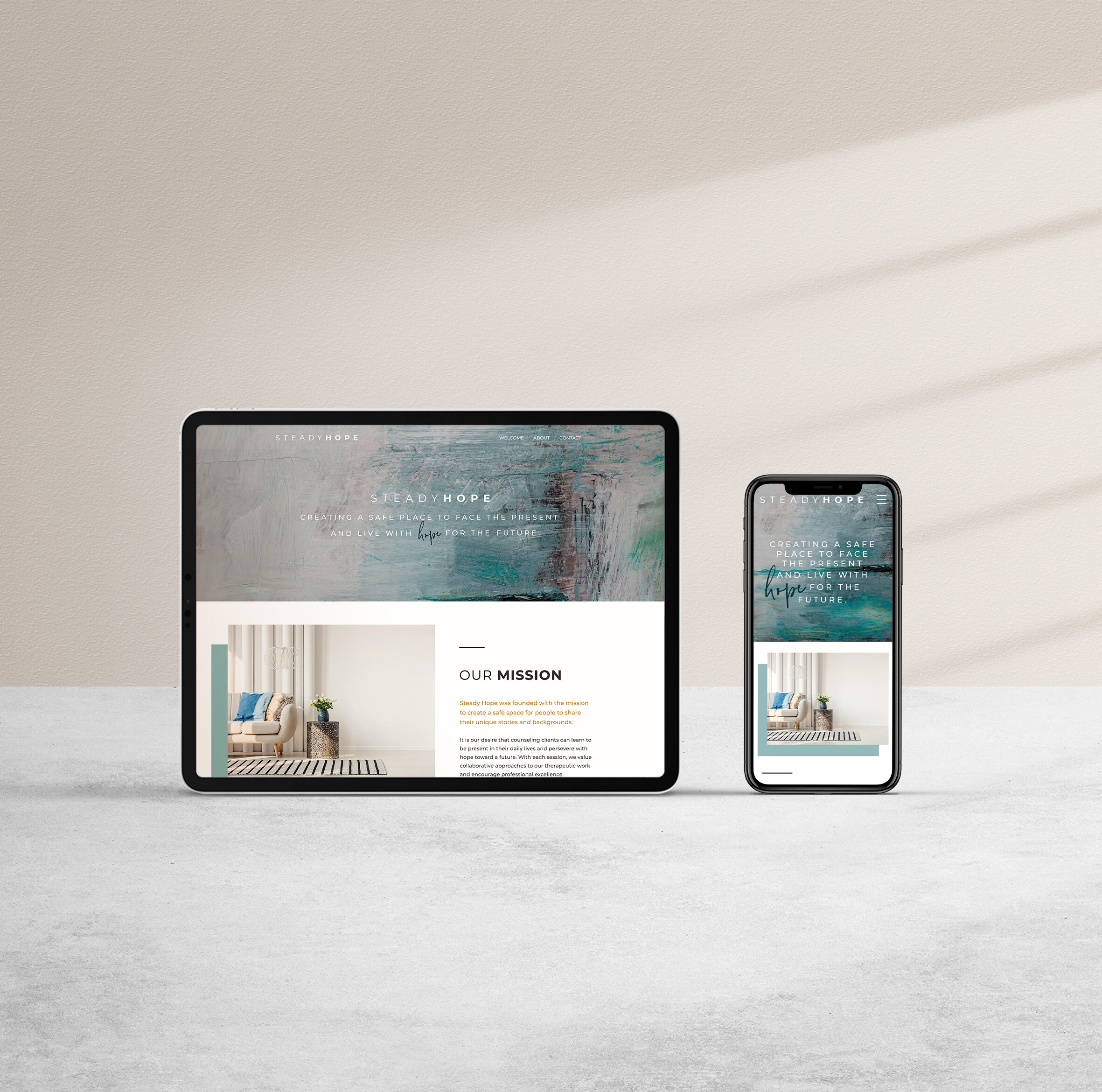
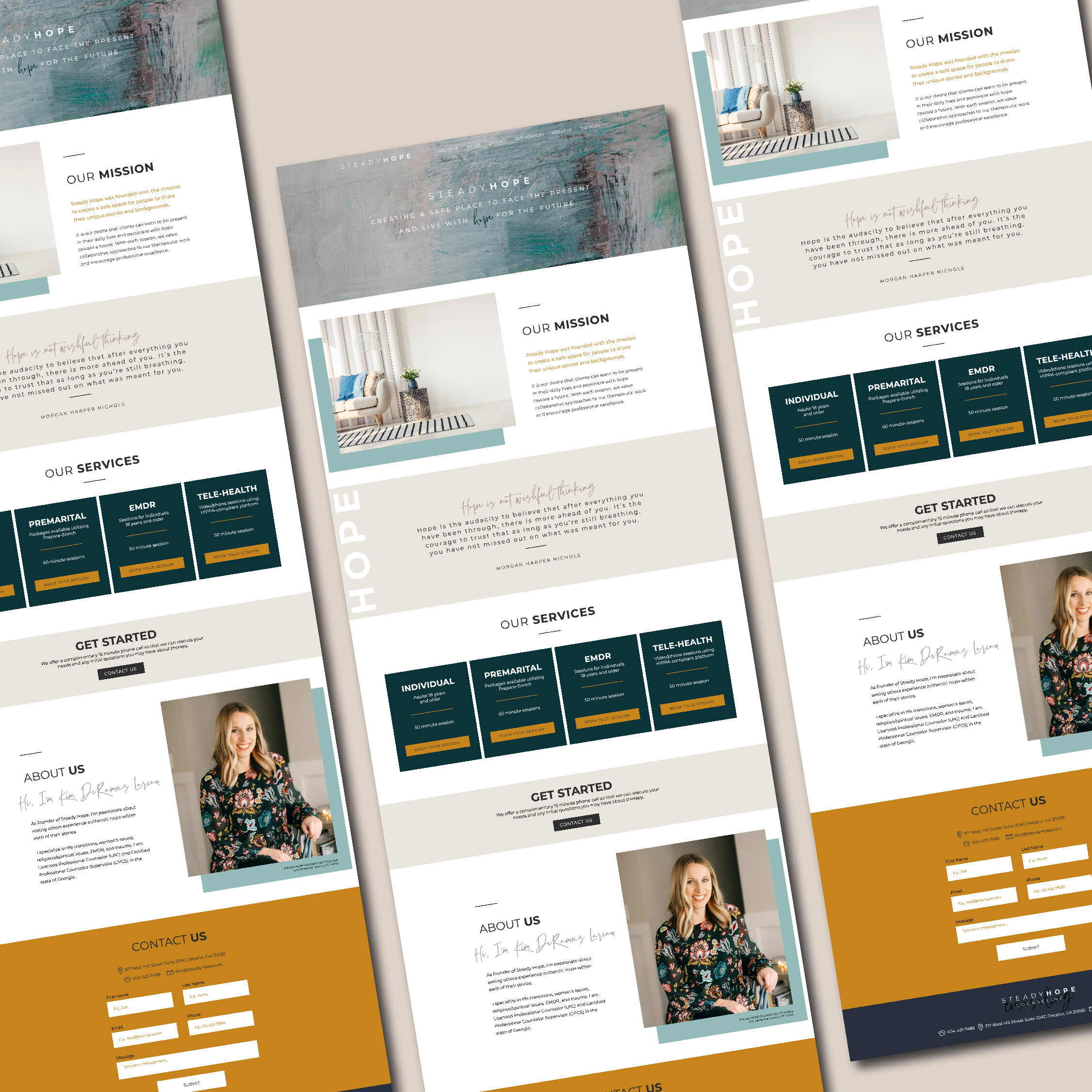
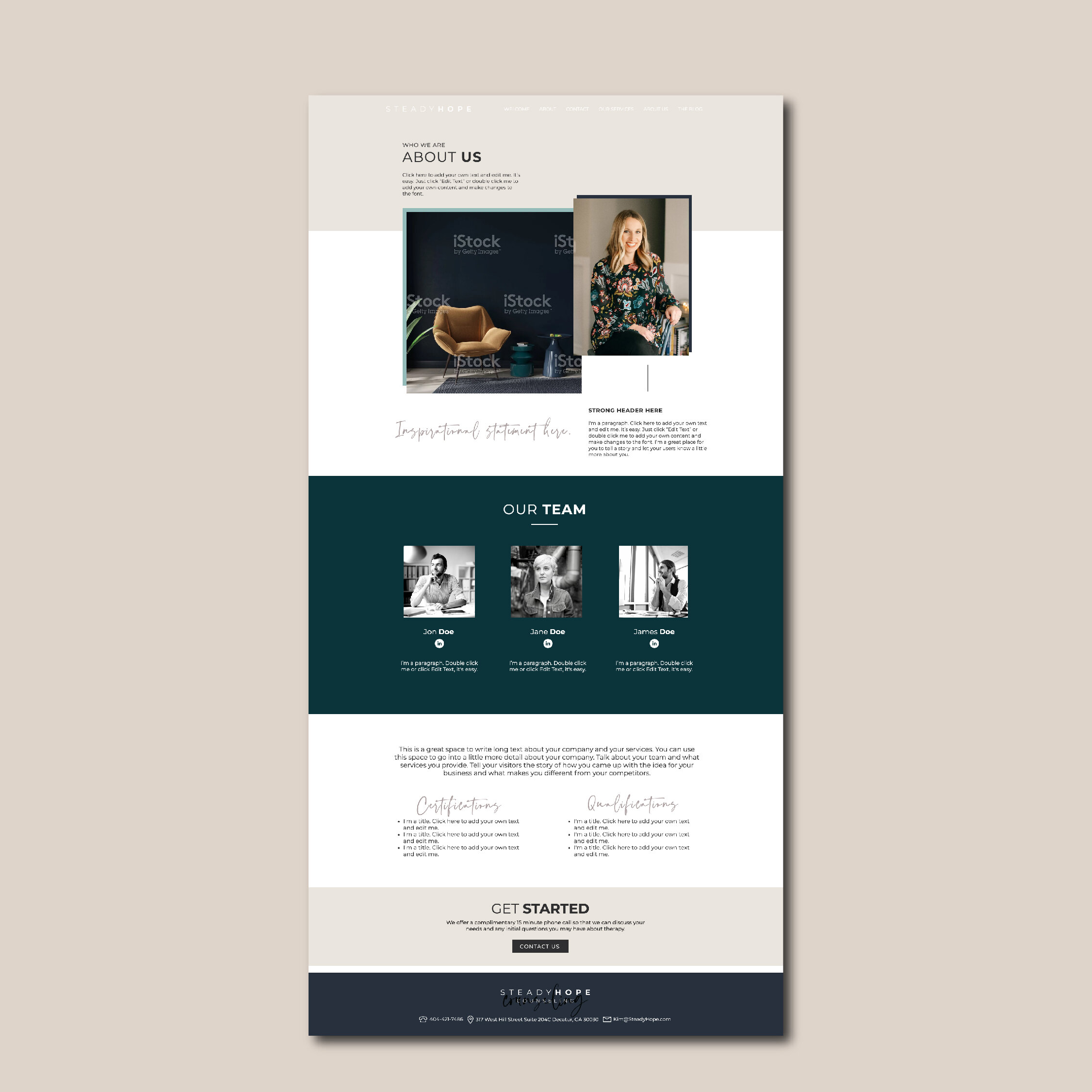
SteadyHope.com, a Billboard site, is a custom Wix website Kim can actually use. Wix is an all-in-one platform, so things like security, updates, hosting— they’re all built in. Plus, it’s drag-and-drop, live-editing so making changes is easy and intuitive. Wix also has a more advanced mobile editor, so each page can be crafted and re-ordered for the best presentation. The billboard site is one scrolling homepage, often using anchor links in the main nav to scroll to specific sections. For SteadyHope, the site opens with an abstract painting and a concise mission statement. I have a 3 second rule with sites, meaning your visitor should be able to tell who you are, what you offer and how you want them to act in 3 seconds or less. That’s why an abstract art piece can be tricky— beautiful, yes, but could it be for a painter? an art dealer? a museum? Pairing this beautiful art with a condensed mission statement helps the audience connect the dots.
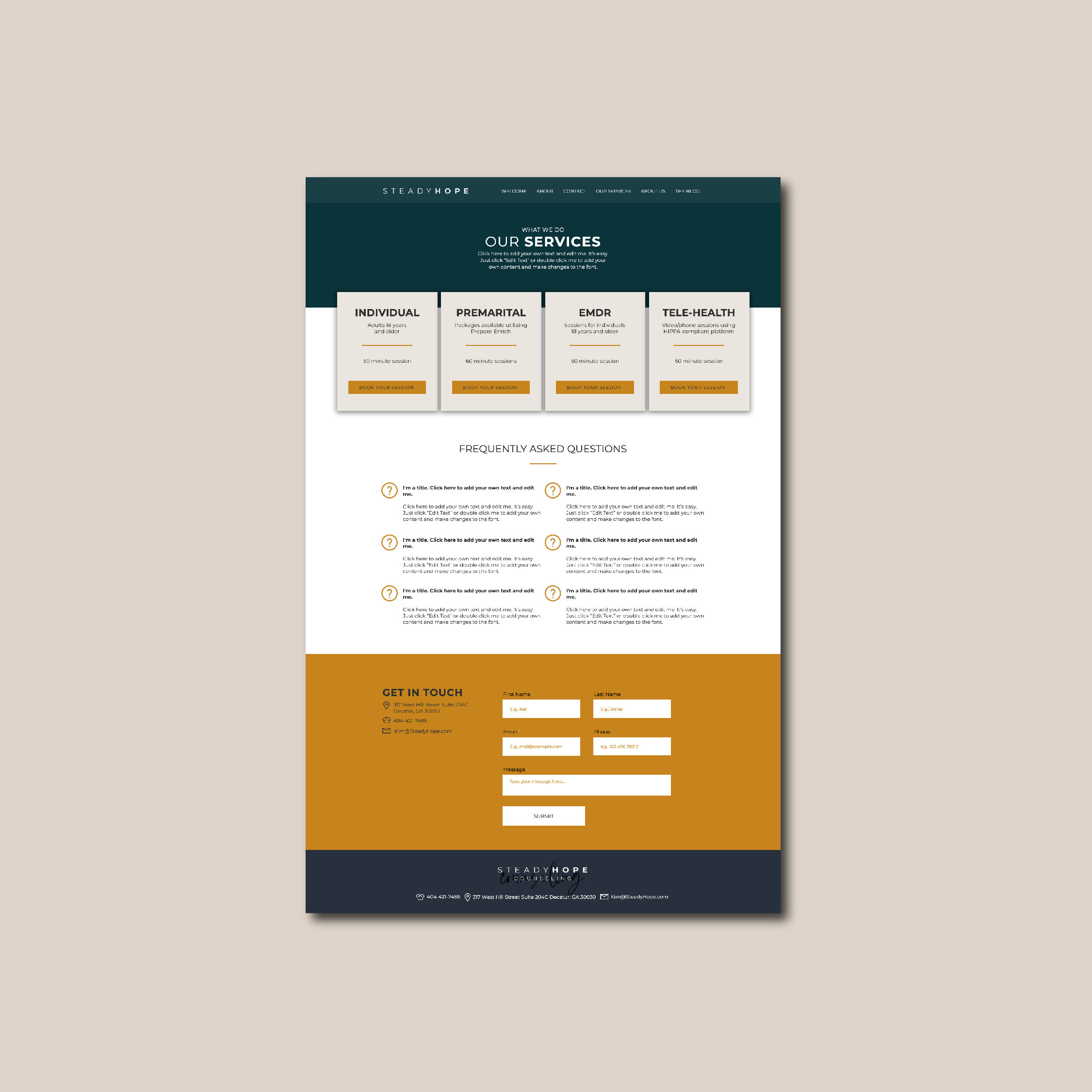
Another of my favorites on this site is the layered elements we used with the photos and color blocks that makes it a bit more creative and design forward. It’s a simple way to say a lot. Knowing SteadyHope plans to grow, we also crafted two internal templates so that future pages can be created from the elements already designed and branded. That’s what makes Wix so easy to use. Unlike Squarespace, where only pages and index sections can be duplicated, Wix is more like Beaver Builder for Wordpress — any element can be duplicated or copied anywhere on the site. It makes designing so much faster, but helps clients maintain the brand as well.
Is Wix right for your business?
Websites are a critical tool to find, connect, and grow your audience. That means you need more than pretty design— you need a platform that’s easy to use so that you’re not wasting time caught up in tech-tape. Wix handles site security, updates and their page builder is intuitive and responsive. Here are three features I love even more than its competitors Wordpress or Squarespace.


