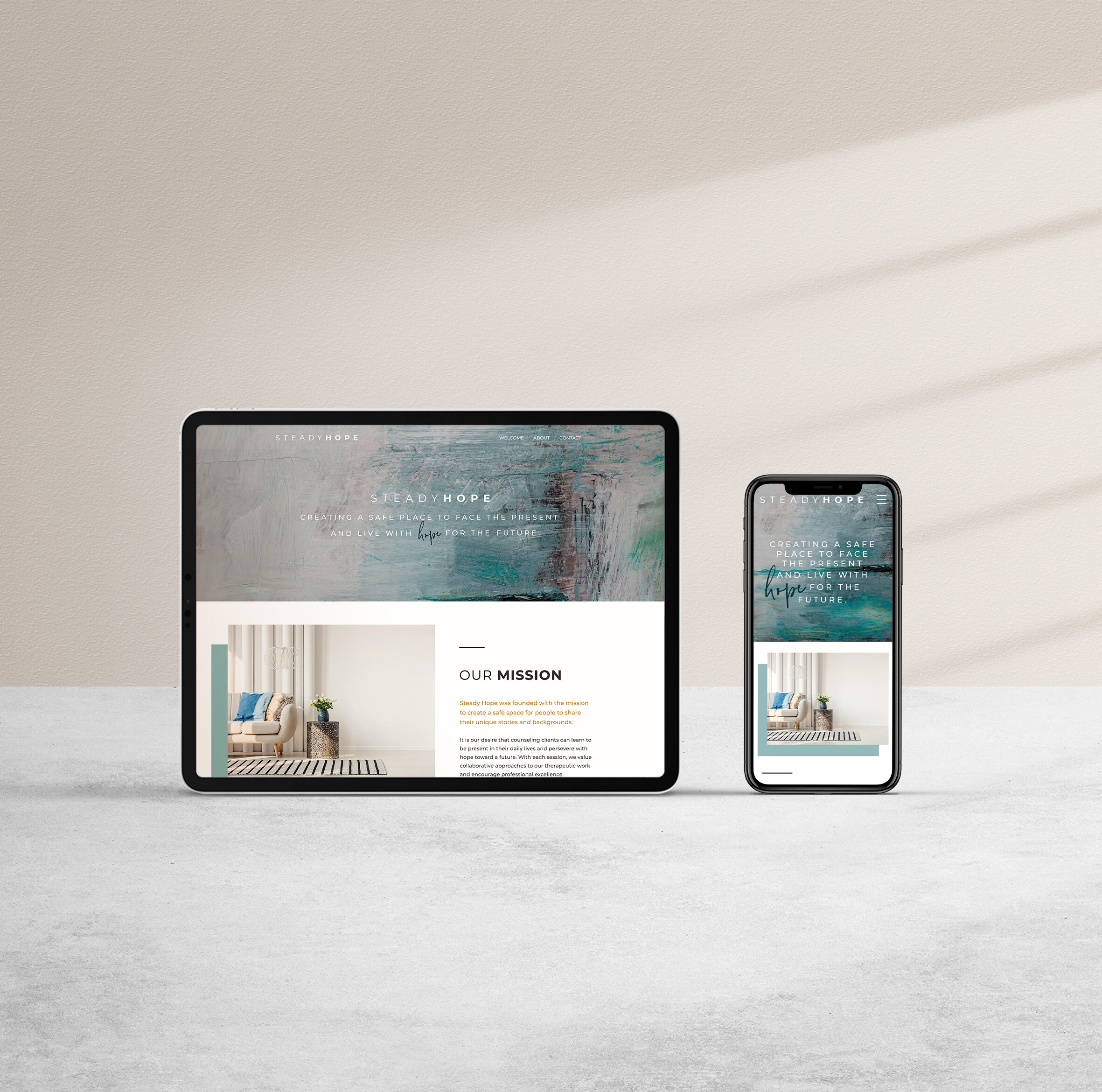
Three Features I Love About Wix
Three features I Love about WIX
While this post will not be an exhaustive comparison of Wix, here’s some helpful info if you’re launching your startup, blog or if you’re designing for clients. Looking for some inspiration? Check out my other Wix sites here.
Wix “strips” feature makes designing easy.
Wix, like many page builder, or drag and drop editors is a do it yourselfers dream. You can design your own website without coding and break into the market fast. Plus, you can maintain it yourself and avoid the high costs of designer retainers. The big seller for platforms like wix is that it allows the user/designer/you to see what you’re doing as you do it. You don’t have to design in the back-end, publish and preview OR toggle back and forth between two windows to see what you’ve changed. You can edit on the page in real time. It’s like mailchimp for web design, but with more functionality.
There are several page builders on the market — Squarespace, Wix and even Wordpress if you use Beaver Builder or Elementor as a plugin. Each one has it’s pros and cons, but I’ll list a few I love so you can decide which one’s best for you. The first feature I love about Wix is that it uses similar editing tools to Beaver Builder. You can create rows, or as wix likes to call them “strips.” Instead of creating an index and adding multiple pages like this squarespace tutorial, you can add a strip to any page, attach elements to it, and move or duplicate all those elements as one. This makes designing so much faster. Plus it gives my clients the ability to duplicate designs I’ve done onto new pages keeping the spacing consistent and giving them the flexibility to add new content on their own. Check out this video to see how.
2. Mobile/Responsive Editing
For everyone that knows me, I can get pretty intense about presentation. My room may be a disaster zone, but if the spacing on my mobile view is off I’ve been known to waste HOURS tweaking the css to get it right. Wix is by far the easiest platform I’ve used for mobile editing. Similar to Elementor, they give you the flexibility to hide elements easily so you can have an alternate layout for mobile. This works great when you have alternating sections on desktop but need the flow on mobile to be opposite. See what I mean here >> Squarespace 7.0 does not have this, so I have to do lots of custom css to make sure a client site looks great. The only issue I have with Wix is that it doesn’t have a tablet view (that I’ve found) so you have to look at that in developer views.
3. Search Engine Optimization - SEO
Search engine optimization has to do with how easy it is for your ideal customer/client to search google or bing and find you. There’s way too much to say about this topic and web design, (this will come in a later post) but Wix makes it pretty easy to do the basics in Search Engine Optimization. They have an SEO tab and a wizard that will help you get the main pieces set up including connecting you to google search console. This is CRITICAL so you can submit and monitor your google results. To learn more about doing this on your wix site, click here. And for more info and tips on wix seo, click here.
In summary, I’ve loved designing on Wix and think it’s a great, easy platform to maintain your site/blog. It’s ideal for bloggers, soloprenuers, and startups who don’t need a lot of animation/javascript but want to maintain their site themselves. Unlike wordpress, which is better for bigger businesses, all your hosting, functionality, etc is built in. There’s no plugins to update— it’s all in one platform.

