
How To: Customize Squarespace for Mobile | Part Two
Remember when we all wanted the smallest phone possible? I’m not ashamed to tell you, I seriously wanted a silver Motorola Razor (which I never got), yet I carry a whopping iPhone+ today. To be honest, I use my phone WAAAAYYY too much — it’s replaced my watch, paper books, MAPQUEST (remember that??), even my calendar is digital. I shop on my phone, browse on my phone and ask Siri to tell me anything I want to know. If you’re a business owner, blogger, or anyone with a website, what does this mean for you?
How to
Customize Squarespace for Mobile
PART TWO
Squarespace does a great job making your site mobile responsive already, but it’s not perfect. Here is some easy CSS code I use on almost every site I design, whether it’s Squarespace, Wordpress, or another platform. And now I’m giving it to you for FREE!
Custom CSS for FontS
One of the biggest issues I’ve wrestled with is font-size on desktop vs. mobile. It’ll make a sane person crazy. Whether you’re struggling with your page layout or squarespace’s built-in responsiveness, I’ve got your solution right here. Check out the screen shots of Calvary Bible Church’s mobile site. This is my homepage and where I’ll have most of my site traffic, so I’d like it to look more like the desktop; only my first three lines of text — h3 (our desire is to..) leaves one word awkwardly on the third line. With some simple CSS (at the end of this post) I can get it to two lines instead. In the second set of screenshots, Selah Counseling, looks rather unimpressive on mobile because the h1 font is too small. Targeting this index page section, makes this solution simple.
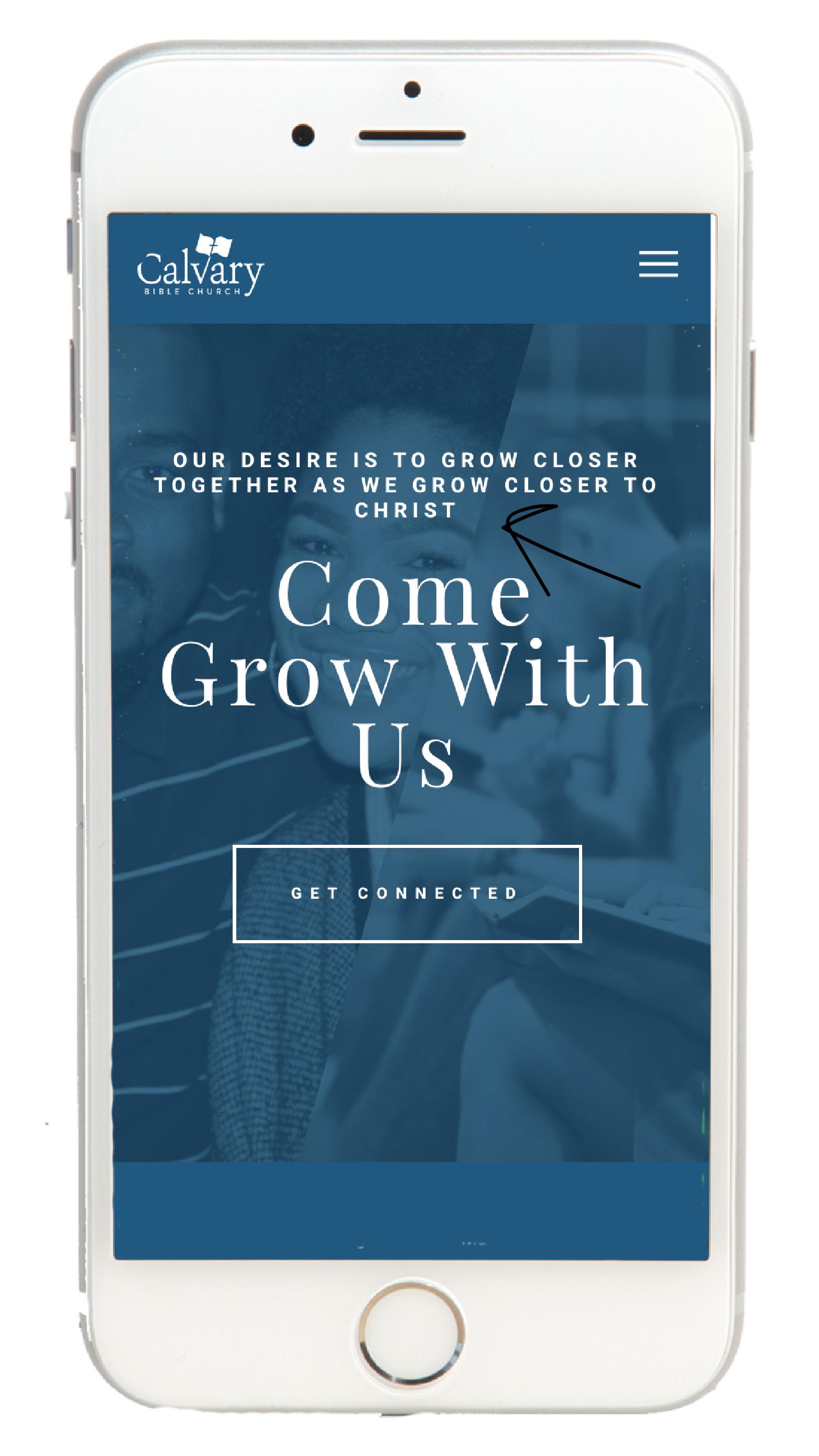
This is an index page without custom coding.

This is the same page with custom coding.

One more time-- without the CSS code.

And with the CSS code.
If you missed part one of this topic, check it out first to learn where the CSS editor is and how to use it. Then come back here to get the code for customizing fonts on squarespace.
To change anything on mobile you need this code: @media screen and (max-width: 640px)
Then, you can target what you want to style using curly brackets. Use h1, h2, h3 and p (p is for your normal, body text) to isolate the specific text your want to change. For this tutorial, I’ll use “h1” and you can substitute what you need in my code.
site-wide
@media only screen and (max-width: 640px)
{h1
{font-size: 70px;}}
On all index pages
@media screen and (max-width: 640px)
{.Index-page-content h1
{font-size: 70px; }}
on a specific index page section
@media screen and (max-width: 640px)
{#sectionurl h1 {
font-size: 70px;}}
You can also change things like kern (letter-spacing), line height, color to help make your layout look just as good on mobile as you’ve designed it for desktop. The best way to learn is to experiment. Just remember, you have to have to look on the mobile view on (at the top of the squarespace panel) to see your code work, but nothing is permanent without hitting save.
Here are some of my favorite CSS resources:
www.w3schools.com
https://paigebrunton.com/
https://circle.squarespace.com
https://thirtyeightvisuals.com/
S-E Web Design Youtube Channel
@media screen and (max-width: 640px)
{h1 {
font-size: 70px;
letter-spacing: 5px;
line-height:60px;
color:white;}}
PRO TIP
I always put my mobile CSS at the bottom of my CSS editor so I can easily find it for changes later.
That's it! If you’re totally new to this, don’t panic. Squarespace has created a step-by-step tutorial showing you the CSS editor and where to find it. Plus, you can ask me. Just put your questions in the comments.
Want other tips and tools? Let me know in the comments!
Until next time,
Dream on, dreamers!
*pssst...! Squarespace A-M-A-Z-I-N-G customer support doesn't cover your custom code, so *if you submit a ticket, you'll want to copy your code into a separate doc while they solve your site problem. I haven't found better, more responsive support in the technical world than Squarespace. #fangirl