How To: Customize Squarespace for Mobile
How to
Customize Squarespace for Mobile
Alright Squarespace fans, you know I love Squarespace. Even though I've started working in wordpress, I have so many pros I could list for squarespace -- like having everything built in, not having to get multiple plug ins and my favorite -- LIVE editing. Squarespace isn't for everyone or for every project... but if you've got your site on it here's a tip you need to customize your site.
Before I tell you this squarespace tip, let me show you why you need it.
Go check your analytics panel to see how many of your visitors are using desktop versus mobile to view your site. Surprising, right? One great thing about Squarespace is that it's mobile responsive -- meaning already built for mobile. You're taken care of even if you don't do anything. But, even though Squarespace is great on mobile, here's some EASY CSS code that will feel like designer jeans for web design. They just look better!
Most people design their site for desktop, so it's hard to craft your content and page layout to look great on every screen. Here's an example of my portfolio showcase for inMission's Branding story.
This is an index page without custom coding.
One more time-- without the CSS code.
This is the same page with custom coding.
And with the CSS code.
To keep words from breaking (like the second images), all you need is this simple code:
p, h1, h2, h3
{-webkit-hyphens: manual !important;
-moz-hyphens: manual !important;
-ms-hyphens: manual !important;
hyphens: manual !important;}
That's it! Not sure what to do next? Here's a step-by-step tutorial just for you.
Step One:
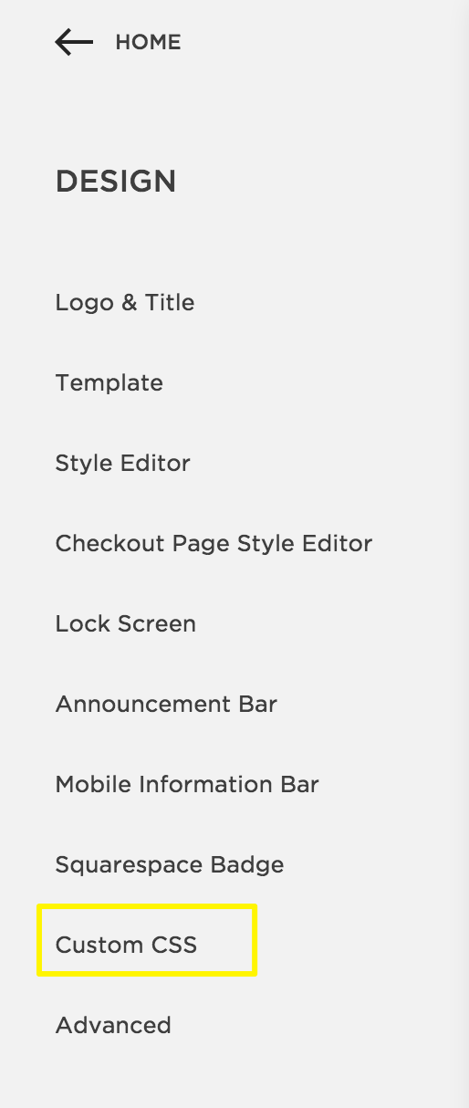
From your main menu, select the second option called, "DESIGN" and scroll down to one of the last options , "Custom CSS."
If you're like I was you're already telling yourself you can't code, so don't touch it! But hang with me and you'll be glad and a bit surprised you did.
Step Two:
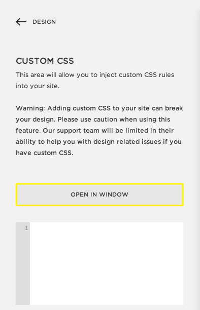
This opens up a text window where you can paste your code! It's that easy.
To help, make sure you're looking at the mobile view so you can see the changes take effect immediately. I've started using it on all my complete web packages and love the difference it makes in how a site presents.
Like what you see?? Try it and let me know your results.
Want other tips and tools? Let me know!
Until next time,
Dream on, dreamers!
*pssst...! Squarespace A-M-A-Z-I-N-G customer support doesn't cover your custom code, so *if you submit a ticket, you'll want to copy your code into a separate doc while they solve your site problem. I haven't found better, more responsive support in the technical than Squarespace. If you have CSS questions, ask me!


